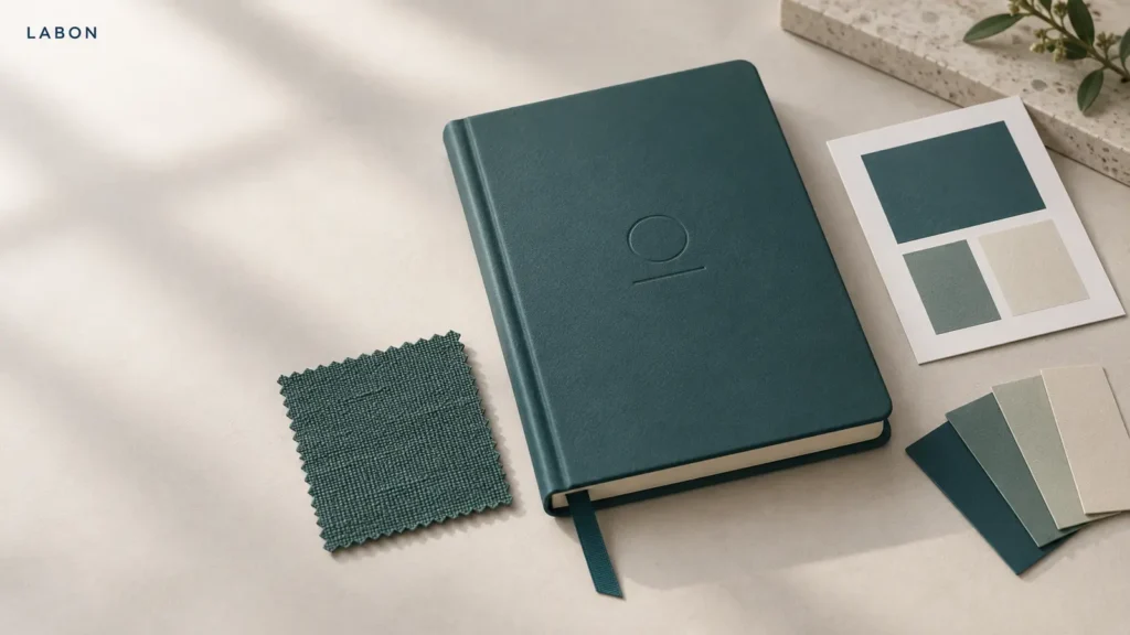
Color mismatch rarely begins on the production line. It usually starts earlier, when a brief says “match our brand teal” but does not identify the material, finish, reference, or approval method. A teal RGB value on a screen, a coated-paper print, a linen cover, a PU cover, foil, ribbon, and a rigid box can all look different while still being described by the same color name.
For a premium custom notebook, color is a system rather than one cover instruction. The practical goal is not to promise an identical appearance across every surface. It is to define the intended reference, decide which components must visually coordinate, and approve the physical result before bulk production. That gives a brand a repeatable decision instead of a debate after cartons are packed.
A color code is a target, not a complete notebook specification
A Pantone reference, CMYK build, brand swatch, or approved previous product is useful because it establishes a target. It does not, on its own, state how that target should be reproduced on a particular notebook component. The substrate, surface texture, ink system, finishing, and viewing light all affect the finished appearance.
Start a color brief with one clearly identified reference. For example: a current physical product, a current physical color guide, or an approved material swatch. Name the reference and version rather than attaching several screenshots with slightly different teal tones. If the target is only digital, treat it as direction for the first sample—not as a final color approval.
The quotation should identify where color appears: cover wrap, endpapers, elastic, ribbon, edge color, insert, and gift box. A code for a printed cover does not automatically define a matching textile ribbon.
Approve each material by the way it is actually made
Printed paper and laminated cover wraps
Printed paper wraps, printed endpapers, and packaging cards need a press-ready file and a defined finish. The same artwork can look quieter after matte lamination or more contrasty under gloss. Paper white, ink density, coating, and the presence of a spot color all matter. Ask to see a proof or production-quality sample on the selected stock and finish, not simply a monitor preview.
If your cover uses a full-bleed illustration, also confirm how the design carries over the spine, wraps around the board, and meets the trim. The broader custom printed notebook specification should state the cover construction alongside the artwork requirements, so color decisions do not become separated from the product being quoted.
PU, linen, cloth, and other non-printed cover materials
For a PU or cloth cover, the most useful reference is a physical material chip or a complete cover sample. Texture changes how light moves across the surface; a grainy PU and woven linen will not reflect color in the same way. If an exact standard is not available in the material range, the brief should say whether the priority is hue, lightness, saturation, or the overall family of colors. “Closest available match” is clearer when it is tied to an approved physical swatch.
Request a swatch before finalizing matching accessories. It is much easier to adjust an elastic, ribbon, or box paper when the cover material is on the table than after every component has been ordered.
Foil, debossing, and other cover details
Foil is not a flat ink color. Its appearance depends on the foil itself, the cover texture, the light, and the contrast with the base material. Approve metallic, white, black, or colored foil on the final cover material and at the intended artwork size. Fine lines that look sharp in a digital mockup can need adjustment once they are pressed into textured PU or cloth.
Keep the finish callout separate from the color callout. A logo may require foil stamping with a shallow debossed indentation rather than a raised effect; that construction decision should appear in the sample brief. For a comparison of the tactile options, see embossing and debossing for custom notebook covers.
What to send in a color-matching brief
A supplier can price and sample more accurately when the color brief answers these questions at the beginning:
- Which physical reference is the approval target?
- Which components must match closely, and which may coordinate rather than match exactly?
- What is the cover material, texture, and surface finish?
- Is the cover printed, wrapped, dyed, or selected from an existing material range?
- Which logo finish is required, including the foil color and recessed or non-recessed effect?
- What are the related components: ribbon, elastic, edge color, endpapers, insert, and box?
- Will the sample be assessed beside an existing product, under a particular light, or against a physical swatch?
Add the target quantity, packaging format, and delivery market to the same request. A notebook gift box can introduce additional papers, ribbons, and inserts; those parts deserve their own color notes and a complete set review. The guidance on notebook gift box inserts is useful here because protection and color presentation need to be approved together.
Use a simple, physical approval sequence
- Confirm the reference. Select the approved color guide, material chip, or existing product. Do not approve from a phone screenshot alone.
- Approve the material direction. Review cover swatches and the closest matching accessory options before final artwork is locked.
- Approve the finished cover. Check printed color or foil on the actual stock, including texture, lamination, debossing, and spine wrap.
- Approve the assembled sample. View the notebook with its ribbon, elastic, endpapers, packaging, and insert rather than judging each item in isolation.
- Keep the approved sample as the reference. Record photos, component notes, and any allowed variation discussion with the order file.
This sequence fits naturally into a broader custom notebook sample approval checklist. It also prevents a common mistake: approving a beautiful cover on its own, then discovering that a warm box paper or pale ribbon changes the perceived color of the whole set.
Four shortcuts that create avoidable rework
Approving a screen capture as the master reference. Screens are useful for discussing direction, but they cannot show a fabric weave, matte coating, or foil reflection.
Using one code for every component without a hierarchy. State which piece is the visual anchor—usually the cover—and which pieces should be the closest available coordination.
Leaving the finish unspecified. “Blue cover” is incomplete without material and surface finish. Matte, soft-touch, gloss, linen, and textured PU all change the result.
Reviewing accessories only after the cover is approved. A premium notebook is experienced as a set. Bring the ribbon, elastic, edge treatment, box, and insert into the physical sample review.
FAQ
Can a Pantone color make every component appear identical across PU, linen, paper, and foil?
No. It provides a useful target, but different materials and finishes reproduce and reflect color differently. Approve the final materials and assembled sample for the color relationship that matters to your product.
Should I send RGB or CMYK values to a custom notebook manufacturer?
Send your working artwork in the file format requested by the supplier and include your brand color references. For printed components, identify any requested CMYK or spot-color instruction; for cover materials and accessories, include physical or material-swatch approval wherever possible.
When should the gift box color be approved?
Approve it with the complete notebook set. A box may look appropriate alone but feel too warm, cool, dark, or pale next to the finished cover and accessories.
Make color approval part of the product brief
Color is most reliable when it is treated as a small production plan: one named reference, material-specific sampling, an assembled set review, and a retained approved sample. When you are ready to develop a custom notebook, journal, planner, or gift set, send LABON your artwork, reference material, and component list for a practical feasibility review.